

How Australia compares on refugees and asylum seekers
This is a story by Inga Ting and Maher Mughrabi from the Sydney Morning Herald on Australia’s stance on refugees and asylum seekers. You can read the full story here. The visualisation of the data was built by Inga Ting and can be found on the Tableau Public website.
This tiny orange dot tells you a lot about Australia’s stance on refugees and asylum seekers. (If you’re having trouble finding it, it’s at the centre of the graphic.)
It shows the ratio of our refugee population to our wealth, expressed in terms of GDP per capita. By this measure, Australia ranked 70th out of 140 countries for its contribution to hosting refugees in 2014 – a year when the number of newly displaced hit a record high.
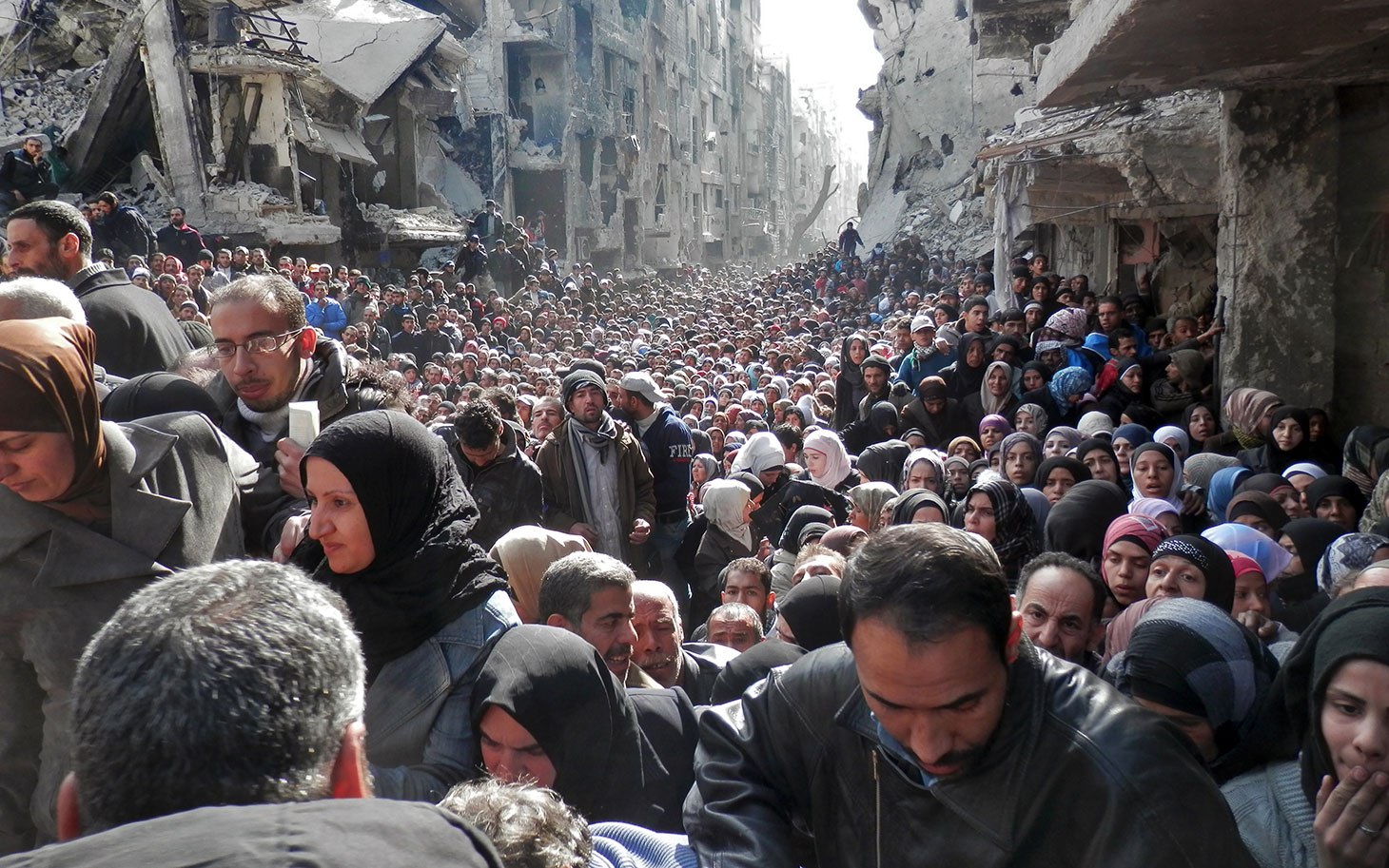
In 2014, more than one million asylum seekers entered more than 20 countries – all developing nations – under group recognition. Around the same number applied for asylum individually. A further 1.8 million applied for temporary protection. This is where the world’s displaced sought asylum (by any official means) in 2014. Australia received less than 9000 asylum applications, or 0.2 per cent of the global total.

